
“Data-driven” might be the most overused phrase in business today. Every company claims to be data-driven. It’s in the job descriptions, the investor decks, the all-hands presentations. But here’s what I’ve learned after 15 years of building analytics functions at companies like Barclays, Tesco, and Deliveroo: most organisations that call themselves “data-driven” are actually data-drowning. They collect mountains of data, build dashboards nobody reads, and then the highest-paid person in the room makes the decision based on gut feel anyway.
This article presents a practical data-driven decision making framework I’ve refined across financial services, retail, and tech. It’s not theory from a textbook. It’s what actually works when you’re sitting in a boardroom trying to convince a VP that the numbers matter.
The Problem with “Data-Driven” Culture
Let’s start with an uncomfortable truth. According to Harvard Business Review research, only 26.5% of organisations report having established a data-driven culture. That number has barely moved in a decade, despite billions spent on analytics tools and data teams.
Why? Because the problem isn’t data. It’s behaviour.
At one financial services firm I worked with (during my time at Barclays), we had every analytics tool you could ask for. Tableau dashboards covering every metric. A data warehouse that cost seven figures to maintain. And yet, most decisions still came down to the HiPPO — the Highest Paid Person’s Opinion. The dashboards existed to confirm decisions already made, not to inform new ones.
McKinsey’s research on data-driven enterprises identifies the same pattern: companies invest in data infrastructure but fail to change how decisions actually get made. The tech stack isn’t the bottleneck — the decision-making process is.
Data-Informed vs Data-Driven: An Important Distinction
Here’s where I’ll say something slightly controversial: you probably shouldn’t aim to be “data-driven.” You should aim to be data-informed.
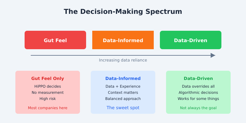
The difference matters. Data-driven implies data makes the decision. Data-informed means data feeds into a decision that also considers experience, market context, and human judgement. As Google’s former Chief Decision Scientist Cassie Kozyrkov has written, blindly following data without understanding its limitations is just as dangerous as ignoring it entirely.
I learned this the hard way at Deliveroo. Our data clearly showed that a particular delivery zone was underperforming — low order volume, high rider wait times, poor unit economics. The data said: close it. But the market context told a different story. A major new residential development was about to complete, bringing thousands of new households into that zone. We kept it open, and within six months it became one of our highest-performing areas.
The data wasn’t wrong — it accurately described the present. But the decision needed to account for the future. That’s what data-informed looks like in practice: data provides the evidence, humans provide the context.
The DAIR Framework: A Practical Approach
After years of watching organisations struggle with this, I developed the DAIR framework. It’s a four-step process that turns raw data into actual business decisions. I’ve used it at enterprise scale and with small teams, and it works in both contexts.
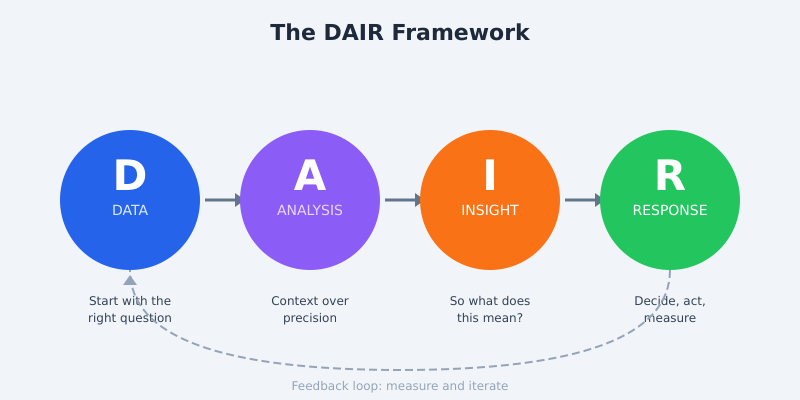
D — Data: Start with the Right Question
Most data projects fail at the very first step. Teams start with “What data do we have?” instead of “What decision are we trying to make?” This is backwards. Harvard Business School’s guidance on data-driven decision making emphasises this same principle: define the question before you touch the data.
At Tesco, we had access to arguably the richest consumer behaviour dataset in UK retail via the Clubcard programme. The temptation was always to start exploring the data and see what interesting patterns emerged. But the projects that delivered real business value always started with a specific question: “Should we expand our premium range in these 50 stores?” or “Which customer segments are most at risk of switching to Aldi?”
Practical tip: Before any analysis, write down the decision this data will inform. If you can’t articulate the decision, you’re not ready to look at data.
A — Analysis: Context Beats Precision
Here’s another uncomfortable truth: most business decisions don’t need statistically perfect analysis. They need directionally correct analysis delivered quickly. I’ve seen too many data teams spend weeks perfecting a model when an 80% accurate answer delivered in two days would have been far more valuable.
The Pareto principle applies perfectly here. 80% of the insight comes from 20% of the analytical effort. Your job in the analysis phase isn’t to be perfect — it’s to be useful.
Practical tip: Set a time box for analysis. If the decision is reversible (most are), limit analysis to 2-3 days. Save the deep dives for irreversible, high-stakes decisions.
I — Insight: The “So What?” Test
This is where most analytics work dies. A team produces a beautifully formatted report showing that website traffic increased 15% month-over-month. The leadership team nods politely and moves on. Why? Because nobody answered the “so what?” question.
An insight isn’t a number. An insight is a number plus context plus implication. “Traffic increased 15%” is a statistic. “Traffic increased 15% driven by organic search, suggesting our SEO investment is paying off and we should increase content production in Q3” — that’s an insight.
Practical tip: Force every data presentation to end with “Therefore, we should…” If you can’t complete that sentence, you have data, not insight.
R — Response: Decide, Act, Measure
The final step is the one most organisations skip entirely. You’ve collected the data, done the analysis, extracted the insight — now you need to actually do something. And then measure whether it worked.
Every response should include three elements: the decision (what are we going to do?), the action (who does what by when?), and the measurement (how will we know if it worked?). Without all three, you’ve just produced an expensive report.
Common Pitfalls That Kill Data Culture
Even with a solid framework, there are four common traps I see organisations fall into repeatedly. I’ve watched each of these destroy data initiatives at companies that should have known better.
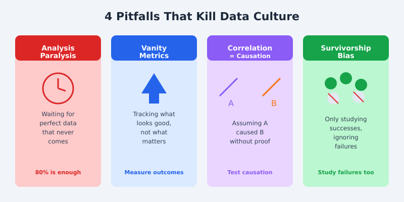
Analysis Paralysis: Waiting for perfect data before making any decision. Perfect data doesn’t exist. At Deliveroo, we made hundreds of operational decisions daily — routing algorithms, promotional targeting, restaurant onboarding prioritisation. If we’d waited for perfect data on any of them, we’d still be waiting. The Gartner concept of decision intelligence recognises this: good enough data delivered in time is more valuable than perfect data delivered too late.
Vanity Metrics Addiction: Tracking what makes you look good instead of what drives the business forward. Page views, social media followers, total registered users — these feel good in a report but rarely correlate with business outcomes. As Eric Ries argues in The Lean Startup, focus on actionable metrics that connect directly to revenue, retention, or customer satisfaction.
Correlation vs Causation: The classic trap. Two metrics move together and someone assumes one caused the other. I once saw a team at a retail company “prove” that email campaigns were driving in-store footfall because both increased during the same period. They’d forgotten about the rather significant variable called “Christmas.”
Survivorship Bias: Only studying what worked while ignoring what failed. If you only analyse your successful product launches, you’ll draw completely wrong conclusions about what drives success. Study the failures — that’s where the real learning lives.
Building the Habit: Weekly Data Rituals
Frameworks are useless without habits. Here are three rituals I’ve implemented at multiple organisations that actually stick. They’re based on what I built at both Tesco and during my consulting engagements.
The 15-Minute Data Stand-Up: Every Monday morning, the team reviews three numbers: one that went up, one that went down, and one that surprised them. No slides. No 50-page decks. Just three numbers and what they mean. This single practice has done more to build data culture than any tool purchase I’ve ever seen.
The Dashboard Audit: Once a month, review every dashboard your team uses. Ask two questions: “Has anyone looked at this in the last 30 days?” and “Has this dashboard directly influenced a decision?” If the answer to both is no, archive it. At one client engagement, we audited 47 dashboards and retired 31 of them. The team’s focus improved immediately because they weren’t drowning in noise.
The Decision Log: Keep a simple spreadsheet tracking: the decision made, the data that informed it, the expected outcome, and (critically) the actual outcome. Review it quarterly. This creates accountability and, over time, shows your organisation how data actually improves decisions. Atlassian’s decision framework playbook offers a similar structured approach worth exploring.
Measuring Whether You’re Actually Data-Driven
Talk is cheap. Here’s how to honestly assess where your organisation sits on the data maturity spectrum. I’ve used this model with clients ranging from startups to FTSE 100 companies, and it consistently reveals blind spots.
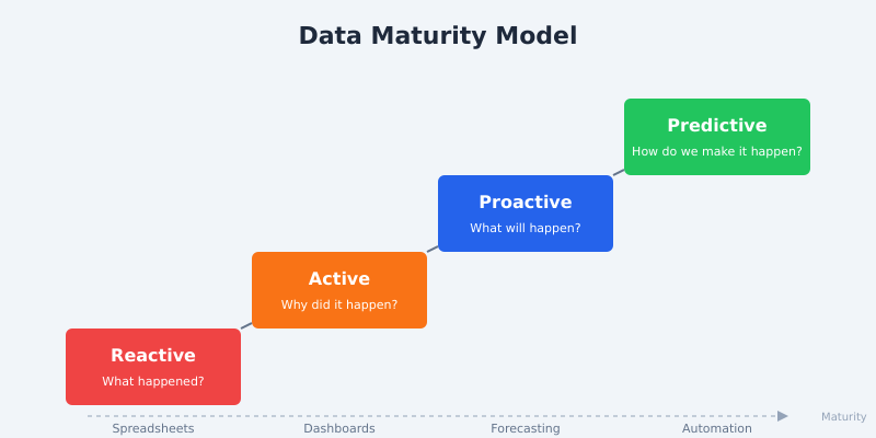
Reactive (Level 1): You look at data after something goes wrong. Reports are generated manually, usually in spreadsheets. Questions like “Why did sales drop last month?” trigger ad-hoc analysis scrambles. Most small businesses and a surprising number of large ones are here.
Active (Level 2): You have dashboards and regular reporting. Teams review metrics weekly. But the analysis is still mostly backward-looking — you’re explaining what happened, not predicting what will happen. This is where the majority of mid-market companies sit.
Proactive (Level 3): You use data to forecast and plan. Predictive models inform resource allocation, inventory planning, or customer retention strategies. Your data team is embedded in business decisions, not just producing reports that sit in someone’s inbox.
Predictive (Level 4): Data-driven processes are automated. Machine learning models make operational decisions in real-time. Humans set the strategy and guardrails; algorithms handle execution within those boundaries. O’Reilly’s research on data-driven organisations shows that only about 15% of enterprises have reached this level in even a portion of their operations.
Where do you want to be? Not every company needs to reach Level 4. A well-run Level 2 organisation that makes consistently good decisions will outperform a Level 4 organisation that automates bad assumptions. The goal isn’t the highest maturity level — it’s the right level for your context.
Frequently Asked Questions
What is a data-driven decision making framework?
A data-driven decision making framework is a structured process for using data to inform business decisions. The DAIR framework (Data, Analysis, Insight, Response) provides four clear steps: define the question your data should answer, analyse with context, extract actionable insights, then decide, act, and measure the results.
What is the difference between data-driven and data-informed?
Data-driven means data makes the decision with minimal human input. Data-informed means data provides evidence that humans combine with experience, market context, and judgement to make decisions. For most business contexts, data-informed is the more practical and effective approach.
How do I start building a data culture in my organisation?
Start small with weekly rituals, not tool purchases. Implement a 15-minute Monday data stand-up where teams discuss three key numbers. Keep a decision log tracking data-informed decisions and their outcomes. Audit your dashboards monthly and retire ones nobody uses. Culture change comes from habits, not software.
What are the biggest mistakes companies make when trying to become data-driven?
The four most common mistakes are: analysis paralysis (waiting for perfect data), vanity metrics addiction (tracking impressive-sounding but meaningless numbers), confusing correlation with causation, and survivorship bias (only studying successes). Avoiding these pitfalls matters more than having sophisticated tools.
How long does it take to become a data-driven organisation?
Realistic expectations matter here. Moving one level on the maturity model typically takes 12-18 months of consistent effort. You can start seeing results from simple rituals within weeks, but genuine cultural change requires sustained commitment from leadership. Technology is rarely the bottleneck — behaviour change is.
The Bottom Line
Being data-driven isn’t about having the most data, the fanciest dashboards, or the largest data team. It’s about asking better questions, building consistent habits, and creating a culture where evidence matters more than opinions.
Start with the DAIR framework. Build the weekly rituals. Honestly assess your maturity level. And remember: the goal isn’t to remove human judgement from decisions — it’s to give human judgement better inputs.
If you’re struggling to make data stick in your organisation, I’ve seen these patterns play out dozens of times. Get in touch and let’s talk about what’s actually blocking your progress. It’s usually not what you think.