
I once watched a talented analyst present forty slides of beautiful charts to a board, and lose the room by slide three. The work was excellent. The communication was a disaster. The executives didn’t want the analysis — they wanted to know what to do. By the time the recommendation arrived, nobody was listening.
That gap — between having good data and getting executives to act on it — is one of the most expensive in any business. After 15 years in analytics, including leading the function at Deliveroo and presenting to plenty of boards myself, I’ve learned that presenting data to executives is a distinct skill, and a learnable one. It has almost nothing to do with making prettier charts.
This guide lays out a simple framework for executive data storytelling: how to structure a briefing so leaders absorb it fast, trust it, and actually make a decision.
Why Smart Analysts Lose the Room
The instinct that makes someone a good analyst — thoroughness, showing your working, anticipating every question — is exactly what sinks an executive briefing. Analysts present the journey. Executives want the destination. They have minutes, not hours, and a dozen competing priorities the moment they leave the room.
There’s a cognitive reason this matters. Practitioners of data storytelling consistently find that clarity and a clear “so what” beat completeness. A single well-framed number that drives a decision outperforms twenty accurate charts that don’t. The job isn’t to inform — it’s to enable a decision.
The Five-Step Executive Briefing
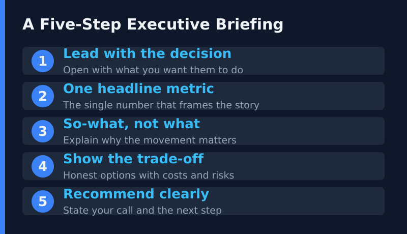
This is the structure I use and teach. It inverts the analyst’s natural order — decision first, evidence second — because that’s how busy leaders consume information.
1. Lead With the Decision
Open with what you want them to do, or what you’re asking them to decide. “I’m recommending we shift £200K of paid budget from Channel A to Channel B.” Now every number that follows has a purpose, and the room knows why they’re listening. Never make executives sit through analysis to discover the point.
2. One Headline Metric
Pick the single number that frames the whole story. Not five, not a dashboard — one. If everything else vanished and they remembered only this figure, they’d still grasp the situation. The discipline of choosing one headline metric forces you to know what actually matters.
3. So-What, Not What
Don’t tell them the number moved — tell them why it matters. “Conversion dropped 4%” is a fact. “Conversion dropped 4%, which is costing us roughly £30K a week and is concentrated entirely in mobile checkout” is a decision-ready insight. Executives can read a chart; what they need from you is the interpretation.
Anyone can report what happened. You’re in the room to explain what it means and what to do about it.
4. Show the Trade-Off Honestly
Credibility comes from honesty about the downside. Present the realistic options with their costs and risks, not a single rosy path. “Option A is faster but riskier; Option B is slower but safer.” Executives are paid to weigh trade-offs — give them the materials to do it, and they’ll trust you far more than the presenter who pretends there’s no catch.
5. Recommend Clearly
End with your call. After laying out the trade-offs, say what you’d do and why. “Given the risk profile, I’d choose Option B and accept the slower timeline.” Leaders respect a clear recommendation, even when they overrule it. Sitting on the fence to avoid being wrong just pushes the hard thinking back onto them.
The Charts That Help (and the Ones That Hurt)
Visuals matter, but most executive decks have it backwards — too many charts, each saying too little. A few rules that have served me well:
- One chart, one message. If a slide makes two points, split it into two slides or cut one.
- Annotate the insight. Put the takeaway in words on the chart, not just the data.
- Cut vanity metrics. Numbers that look impressive but drive no decision waste the room’s attention.
- Be honest with axes. Truncated axes that exaggerate a trend destroy trust the moment someone notices.
The goal of a chart in an executive setting isn’t to display data — it’s to make one point land instantly. If a leader has to study it, it has already failed.
From Presentation to Habit
The best executive communication isn’t a one-off performance — it’s a regular rhythm. When leaders see the same trusted view on a predictable cadence, they learn to read it quickly and act fast. That habit is the heart of a mature data culture, which I explored in Building a Data Culture. And it pairs naturally with asking sharper questions of the data, like the weekly ones I set out in The 5 Analytics Questions Every E-commerce CEO Should Ask Weekly.
Frequently Asked Questions
How many slides should an executive data briefing have?
Fewer than you think. For most decisions, three to five focused slides beat thirty. If you can’t make the case in five, you haven’t found the core of it yet. Keep the detailed analysis in an appendix for anyone who asks.
What if executives ask a question I can’t answer?
Say so, and commit to follow up. “I don’t have that to hand — I’ll send it by end of day.” Honesty builds more trust than a confident guess, and a wrong number presented confidently can quietly steer a major decision the wrong way.
Should I send the deck before or after the meeting?
Send a short version ahead so people arrive informed, and keep the live session for discussion and the decision. Reading slides aloud to executives is the fastest way to lose them.
Key Takeaways
Presenting data to executives is about enabling a decision, not displaying analysis. Lead with the decision, anchor on one headline metric, explain the so-what, show the trade-offs honestly, and end with a clear recommendation. Cut the vanity charts, annotate the insight, and turn the briefing into a regular rhythm. Do that, and your data will start changing decisions instead of decorating slides.